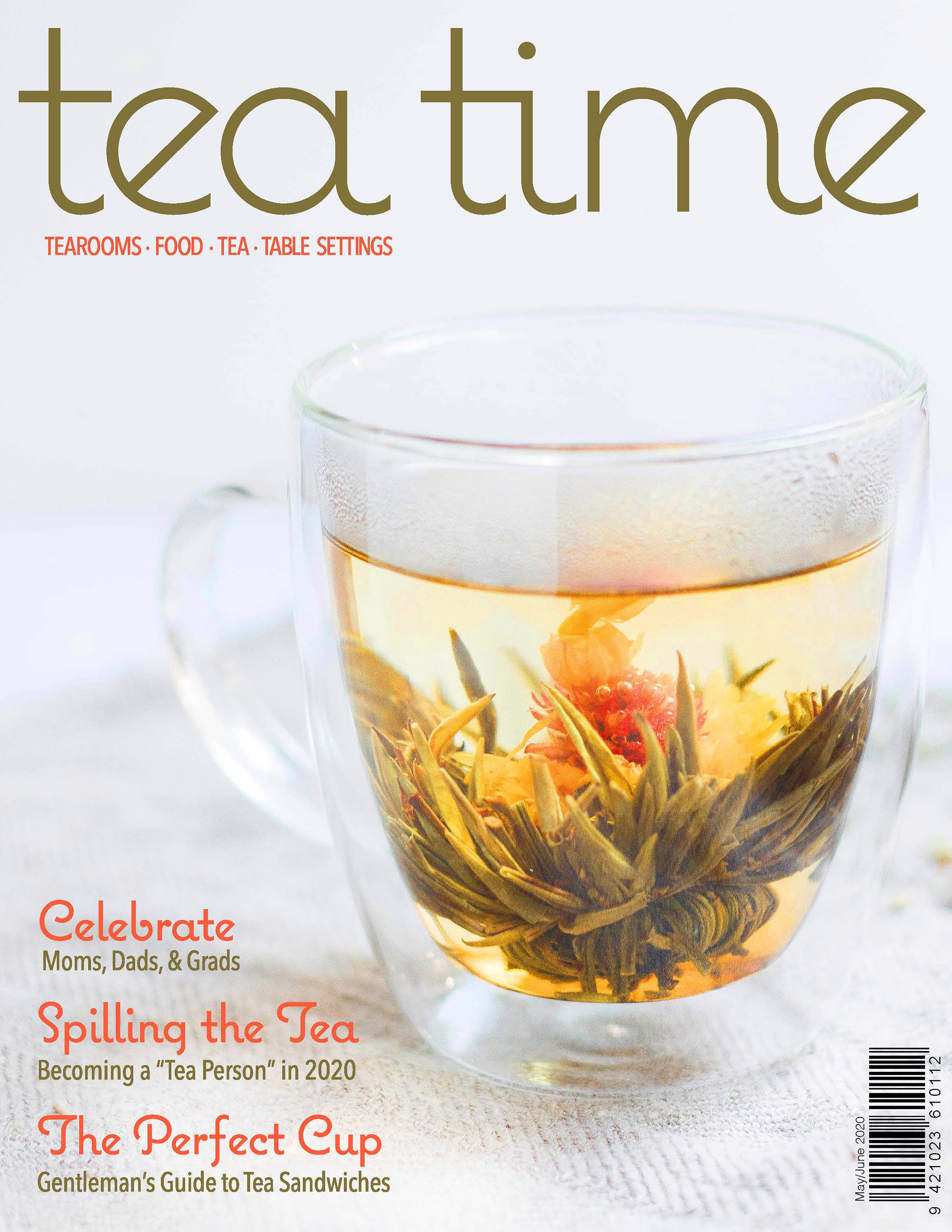
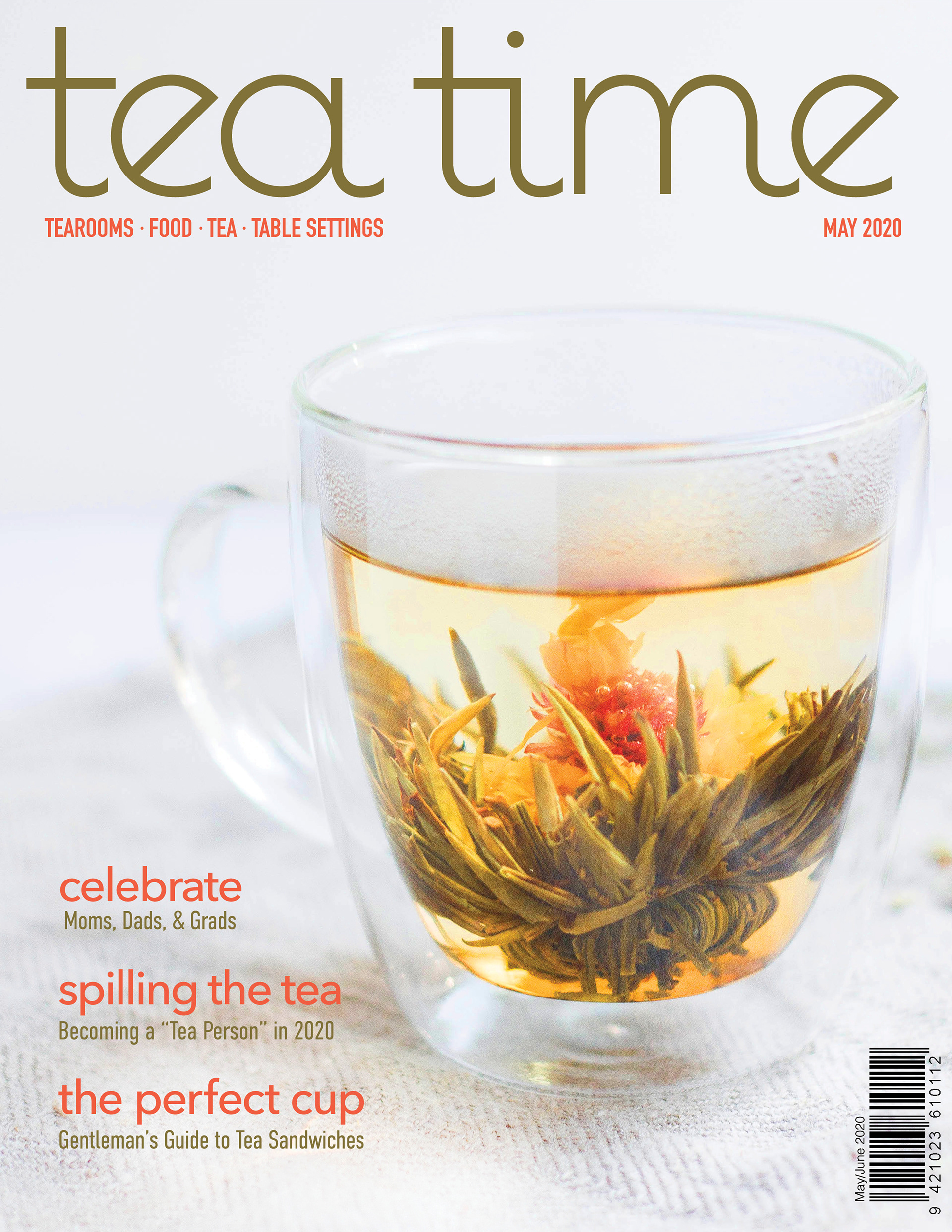
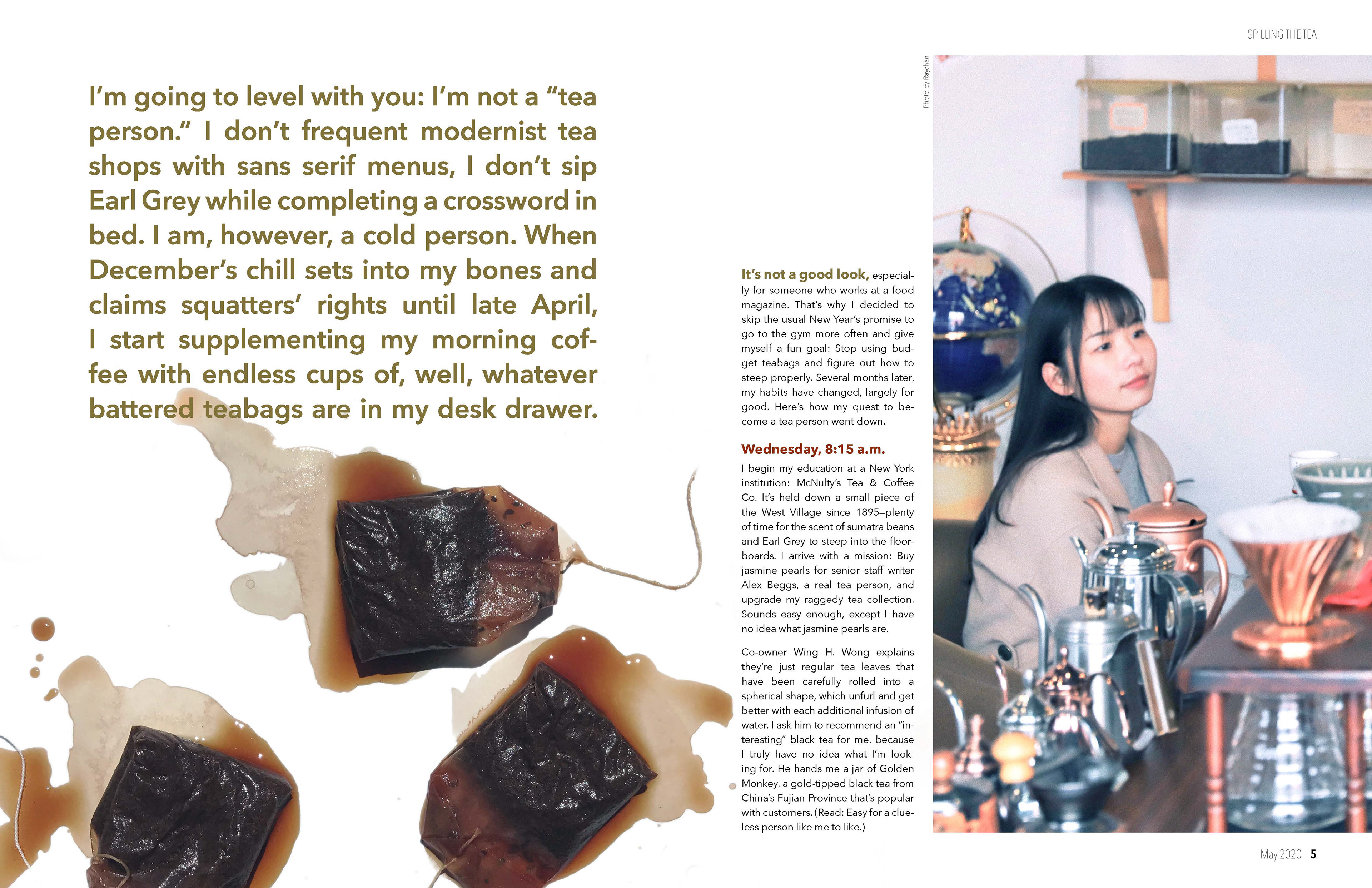
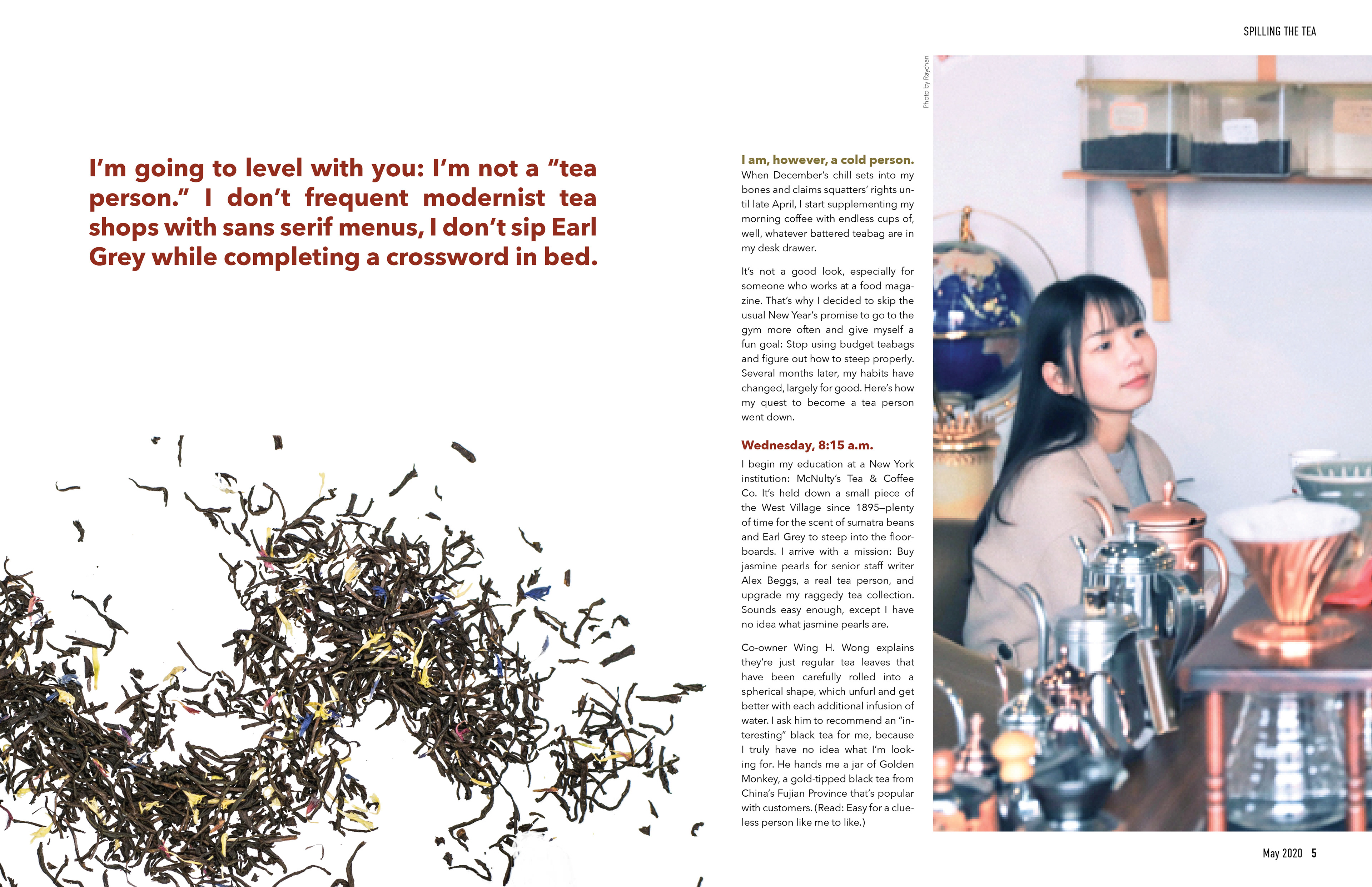
Tea Time Magazine was long overdue for an overhaul, and as someone who loves tea I thought it would be a fun project to take on. The original design looked like every unread magazine you saw at your grandma’s house and did little to celebrate the masterful art of teamaking. My goal was to revamp the aesthetic and have it appeal to a more youthful audience.
Process


The cover went through several changes, most notably the shift from Futura Condensed to Bebas Neue in the subheadings as well as a change to the callouts along the left side of the cover. Originally, I used the same font in the titles as the masthead, but realized it was distracting and undermined the simple elegance of the composition.


The opening page of the article itself also underwent significant changes. I realized the original opening paragraph was way too lengthy and didn't really draw people into the article. The tea bags were also not the most appealing imagery, so I changed to a loose leaf tea that matched the style of the title spread.
